In a world where images play an important role, typography must not be forgotten! Its legibility and aesthetics are of paramount importance. Let me explain why and save your communication!
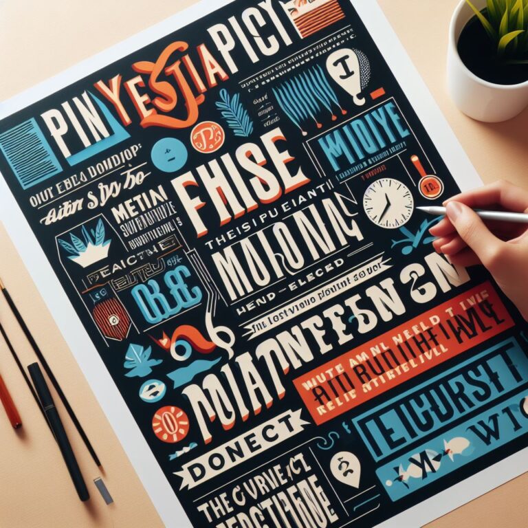
"Much more than words: Discover the subtle art of typography"
We’ve all had to deal with a poster or website that gave us an eye sore because it was illegible. Without being able to explain it at first, we soon realize that the same poster written differently would be much more pleasant to read. But do you know why?
Typography that is too distorted or too colorful and contrasting can quickly become unbearable. It’s difficult to read, and you’re doing a disservice to the message you want to get across, because the people interested won’t read on because they’re uncomfortable or don’t like it. There are a few tips and tricks for using typography to complement the graphic work you’ve already done (obviously with the help of my other blogpost :)). This new blogpost will give you a better understanding of the central role played by typography and if you’d like to find out more, I invite you to leave a comment or have a look at my website.
The keys to an attention-grabbing text?
When it comes to graphic design and typography, there are a number of key points to bear in mind:
legibility
coherence (no overly folkloric typography for a very serious subject)
hierarchy
color and contrast
size
Why are all these points important? Well, they are what will help your message to be seen and understood. Whatever its nature, you need to adapt these different points so that they are consistent.
Let’s take a closer look!
1-Legibility and consistency = your brand’s best friends
Legible text is important. If your text is in a more childish or folkloric
typography when you need to get a very serious or important message
across, this can be problematic. When reading it, your target
audience won’t know which way to turn (fun or serious). So choose a typography that is consistent with your message and doesn’t make it difficult to read or stand out from your message.
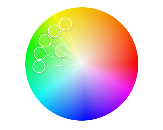
2- Color and contrast for an information podium
Once you’ve chosen your typeface, you need to know what color you can apply to it. Why is this important? Imagine a red poster with dark orange lettering? I know that doesn’t inspire you. That’s why color is so important. It’s going to make your message stand out and not get lost in all the other information that might be conveyed. The aim is for your color to really stand out against the background, without making a bad combination – think of complementary colors!
3- Size and hierarchy, a real scale of strength!
In a book, words that are too large will tend to grab your attention! Well, it’s the same for your communication. You need to play with the size and thickness of your text. Why do you do this? Quite simply, to organize your information into a hierarchy, a bigger headline and a gradation of size on the other information will help to organize the reading into a hierarchy. By reflex, we’ll start with the biggest and most visible, then gradually work our way down to the least prominent and the most complicated to read! Try it out on yourself or your colleagues by sharing this blog, and you’ll soon see how it works!
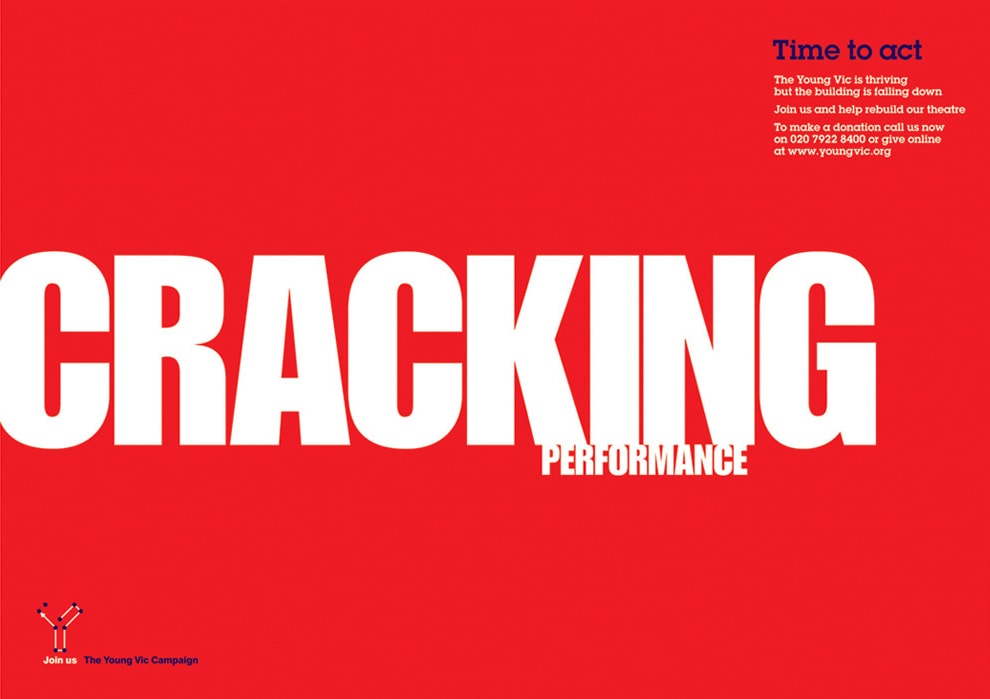
Above all, don’t forget that a good message is readable, coherent and organized in a hierarchy – that’s the key!
And don’t forget to check out the next blogpost in which we’ll be talking about the creative process 🙂
With the blogposts combined, you’ll have optimized communication!